Posts

5/2: Final Portfolio

Image
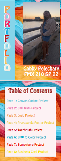
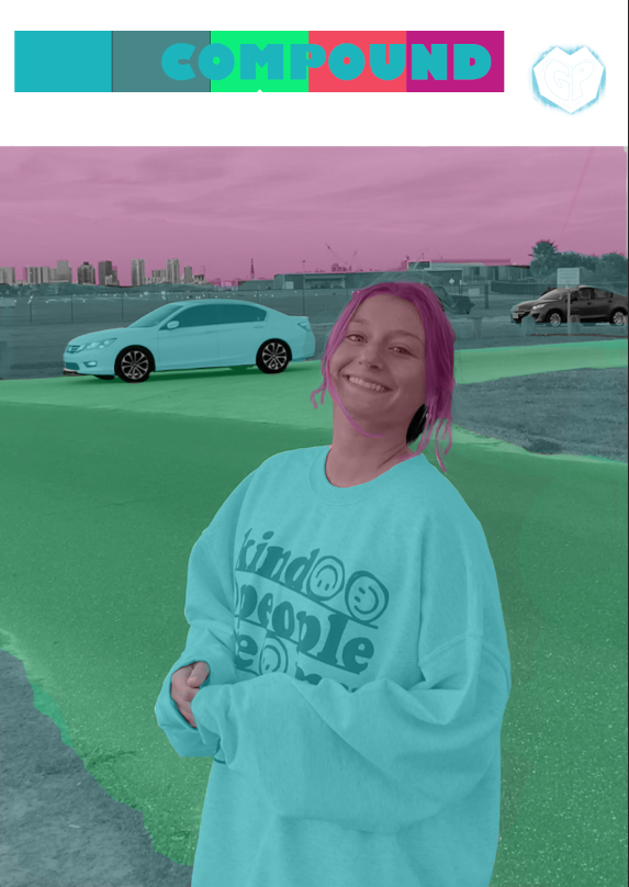
 To end the class, we made a portfolio of all the work we have completed this semester. I had a lot of fun making it my own and being able to showcase all my hard work over the past couple months. I made my book in InDeisgn and rather than using a pre-made template, I decided to make it completely on my own which was very fun. I wanted it to be completely authentic and made by me because I plan to keep this as a way to to continue to advertise my work.       Over the last few months, I have learned how to use Adobe Creative Cloud apps such as: Dreamweaver, Illustrator, Photoshop, and InDesign. I think this project is so helpful because it shows me all the progress I have made when it comes to my own art. I enjoyed this class thoroughly and it is nice to see all of my work showcased. I think I will use this portfolio not only to show my work but as a marker of progress and and the ways I improve my art in the future.  Artists Statement: HI! My name is Gabby Pelechaty and I am currently

4/23: Business Card Project

Image
      This week, we moved to a new Adobe App called InDesign. I have worked inside of it once before and was not to fond of the way it worked. However, after this project, i really appreciate the way it can make any simple design really professional. Although the tools are pretty easy and basic, Professor Roundtree really helped me understand how I can use them to my advantage which I appreciate. My logo that I created a few weeks ago was mor eon the cute side so I wanted to try and make layout mor professional looking but also keep that fun and light theme.      At first, like I predicted, I had difficulty using the framing tools and understanding exactly how to move images. However, once I got the hang of it, it became pretty easy. I looked online and through student work for some inspiration. I made some sketches on my own and wanted each card to be completely different. I wanted them to have their own color scheme and tried to utilize a diverse array of tools each time. I spent a l

4/23: InDesign Intro

Image
 Video1: https://www.youtube.com/watch?v=mSfYVn5MqbQ      In this video, the creator thoroughly explains come tools in InDesign. I find it really interesting how similar yet different each application is. One of the tools that seemed similar yet a bit different than the other creative cloud apps is the select tool particularly how it moves images and objects around. The video explains how InDesign puts everything into a frame, I am assuming for layout purposes. I noticed when he was inserting images, the shape you put your image into is different than the actual image., You can move the image around within the frame. The image and the shape you insert the image into are two different entities.  Video 2: https://www.youtube.com/watch?v=QDfM8VmDRzQ     In this video, the creator does a similar job as the first one. They go through all the basic capabilities that each tool has. Although I didn't think any of them were too hard I thought the scissor tool. Once you place an image into I

4/18: Somewhere

Image
      For this assignment I was very excited to be able to photoshop myself into one of my favorite movies. I really enjoyed being able to choose the scene and make it my own. I really had a fun time utilizing the various tools and techniques we used in photoshop. Before shooting my photo, I looked at the lighting and overall color of the image and tried to recreate it. There is a lot of natural light in the photo so I shot my picture in daylight and also used a LED lights to replicate that glow in the photo. I found this project to be very enjoyable and not too hard. It was fairly easy to take the picture and decide where I wanted to crop myself in. I had trouble adjusting my body size because my head had to be proportional to Timothee Chalamets and also the book I was holding had to be comparable to the books on the ledge. Because I got the lighting pretty much spot on, and the magnetic lasso tool made it easy to cut myself in, the only thing I really had to play around with was the

4/12: Pre Somewhere Post

Image
  Write a blog post after visiting these 4 websites/links: go to  https://www.instagra m.com/kirbyjenner/?hl=en ; find 1 image you think it would be really hard to photoshop yourself in to, post the image and the comment on your blog  go to  https://www.instagram.com/averagerob/ ;  find 1 image that inspired you or gave you an idea for the "Somewhere" project. Post the image and the comment on your blog  go to  https://www.boredpanda.com/funny-photoshop-troll-james-fridman/  find 1 set of images that made you laugh, post them on your blog with your comment  go to  https://www.boredpanda.com/reality-behind-photography/  which illusion you think you might want to recreate? Post the inspiring image and comment If you have questions, or any idea you want to run by me, do not hesitate to contact me 1. I think this post would be really hard to photoshop myself into for  a few reasons. I think a pose would be hard to chose as well as a place to photoshop myself. I also think correct

4/11: Black and White to Color Project

Image
This week, I changed a black and white photo into a color, more stylized piece of art by using masking and the selection tools in photoshop. I really enjoyed seeing how this turned out and had so much fun choosing the color combinations I wanted and the different ways I am able to make one photo look. My favorite one was probably the compound combination I chose.  I found the most difficult part actually starting the project. Before learning to mask I would have previously colored every individual element of the image. However, masking each layer out and having each color easily applied to the selection I used by drawing with the magnetic lasso tool. All in all, I am really pleased with the final project and I know once I get more comfortable with the app and the tools my artwork will only get better.

4/6: Tagbrush Logo

Image
 This project was particularly tough for me to figure out but now that I have this brush option, I understand why we completed this. Its a rally fun and easy project once you are finished as it is stylizes your logo to make it stand out on your artwork. Now that I have this brush downloaded onto my folder, I think it is a really unique way to suggest the artwork is mine.  At first, I found this project to be a bit difficult. Although there were a lot of steps, after reviewing the directions provided and completing them one step out of a time, it became a lot easier. I really enjoyed seeing how my logo came out in this stylized matter I think it gave it a really unique look.